EcoBank
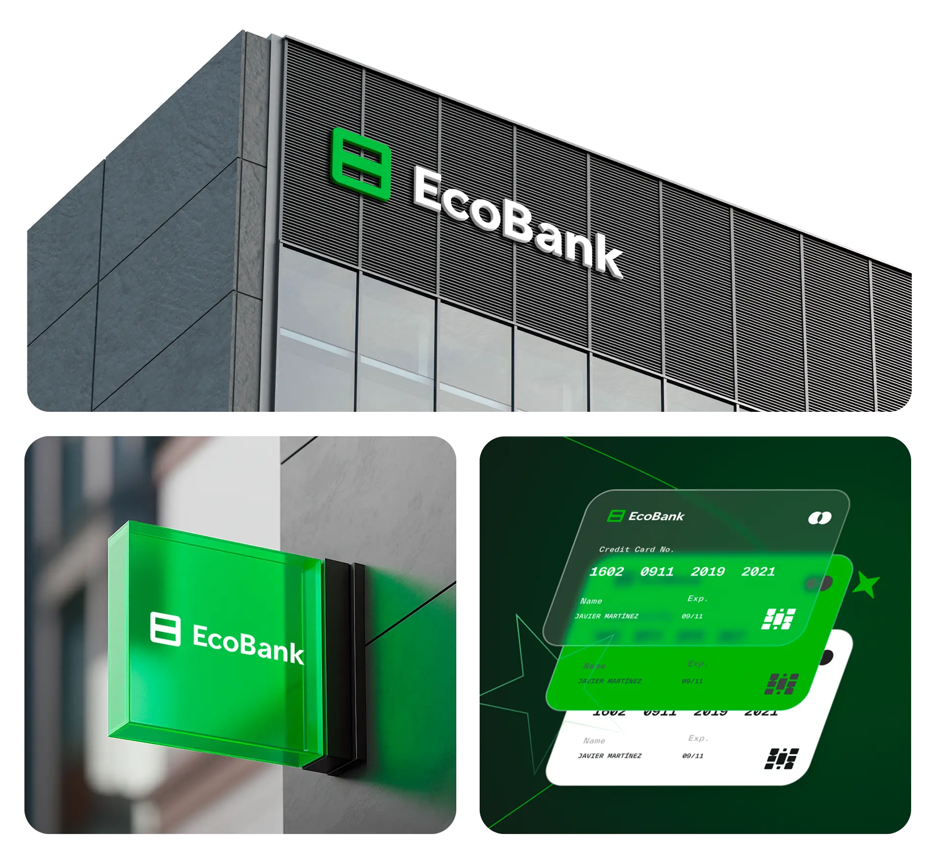
Branding Identity and UX/UI for EcoBank, is an innovative digital bank that is transforming the traditional financial sector by placing sustainability and equity at the core of its offering.
Brand Identity
UI/UX design
THE PROJECT
EcoBank is based on two essential pillars: equality and transparency. Its proposal goes beyond offering financial services; it seeks to create a banking ecosystem where the interests of the customer and the company are perfectly aligned.
DESIGN SYSTEM
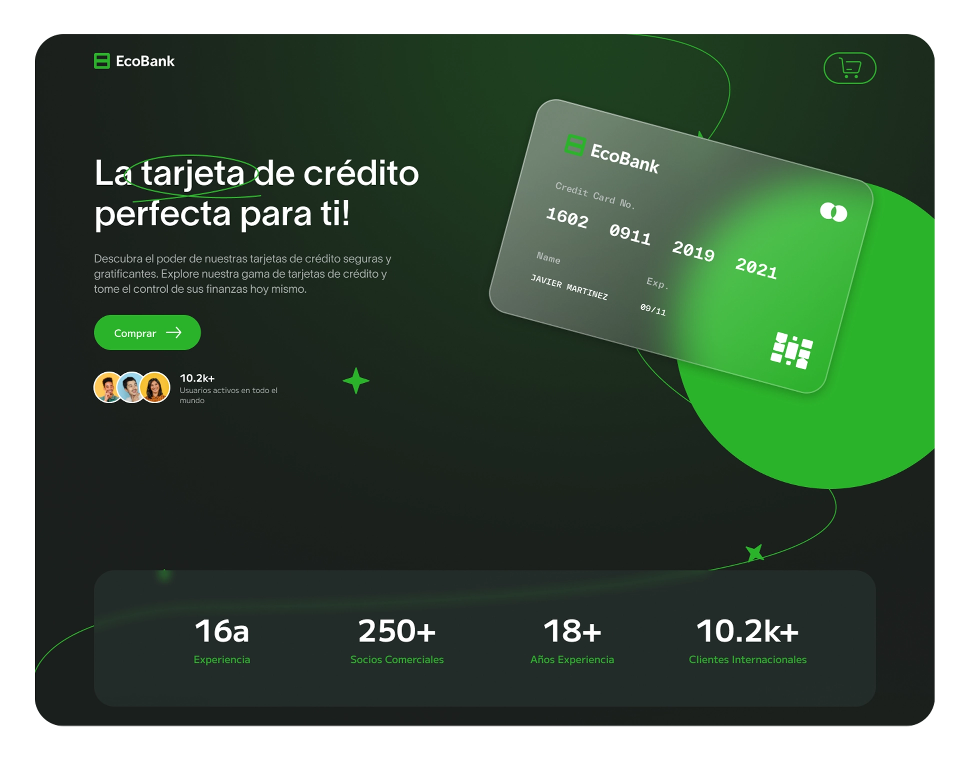
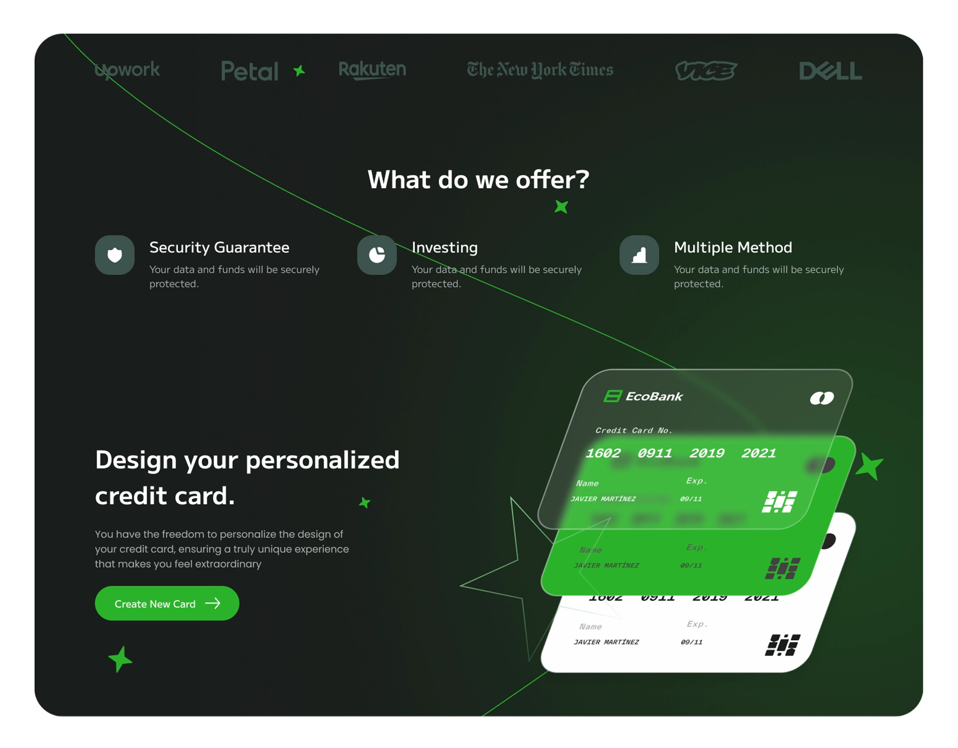
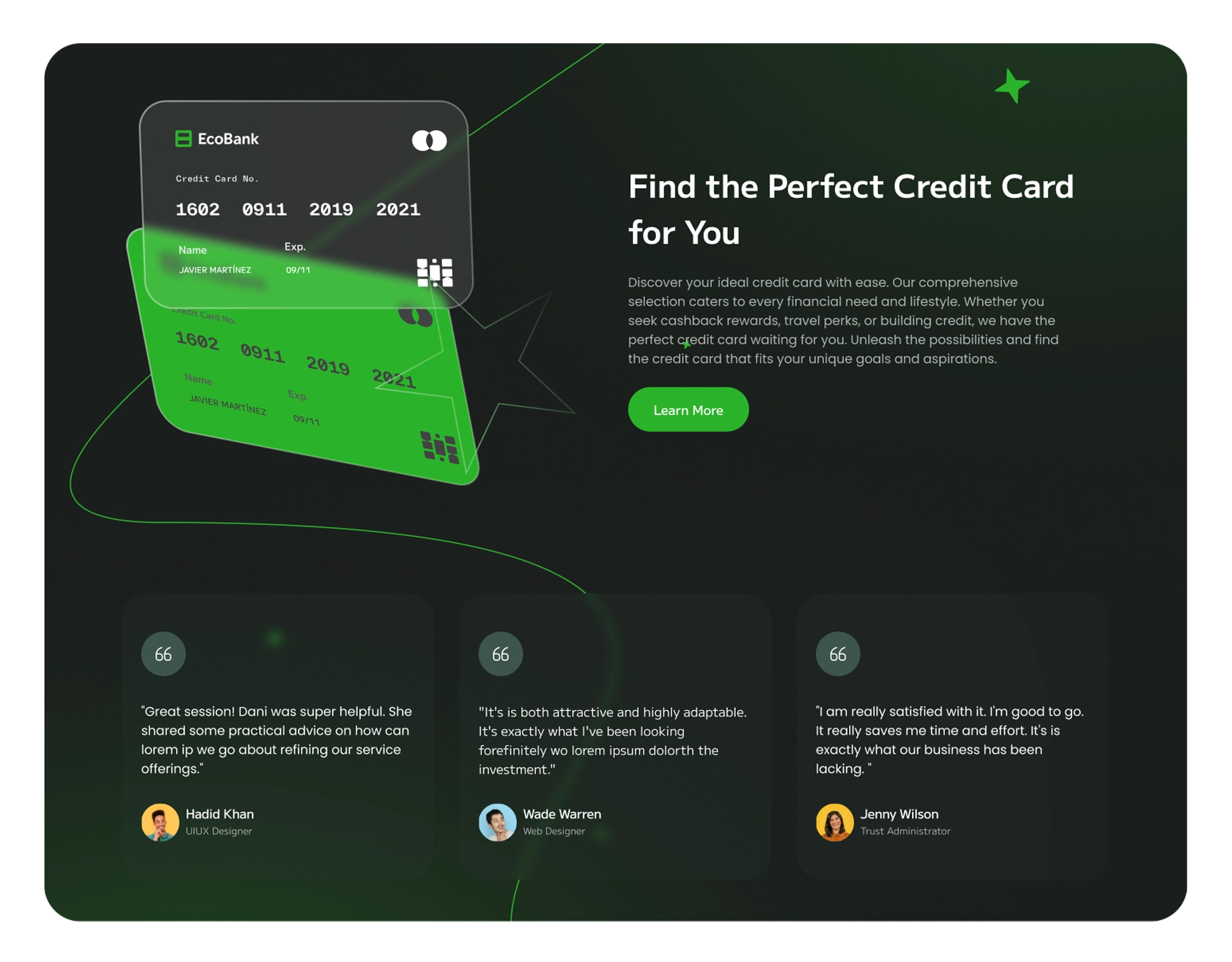
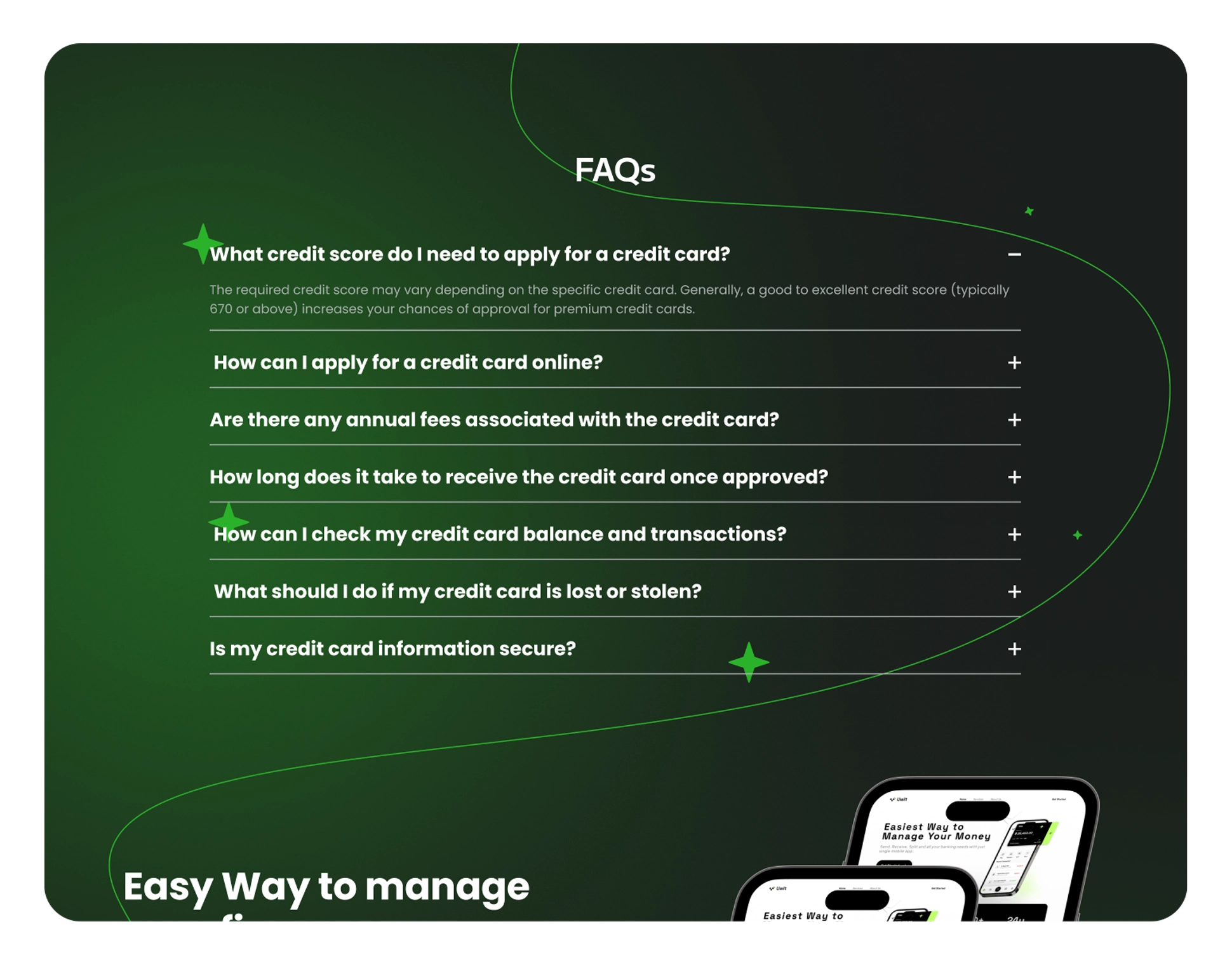
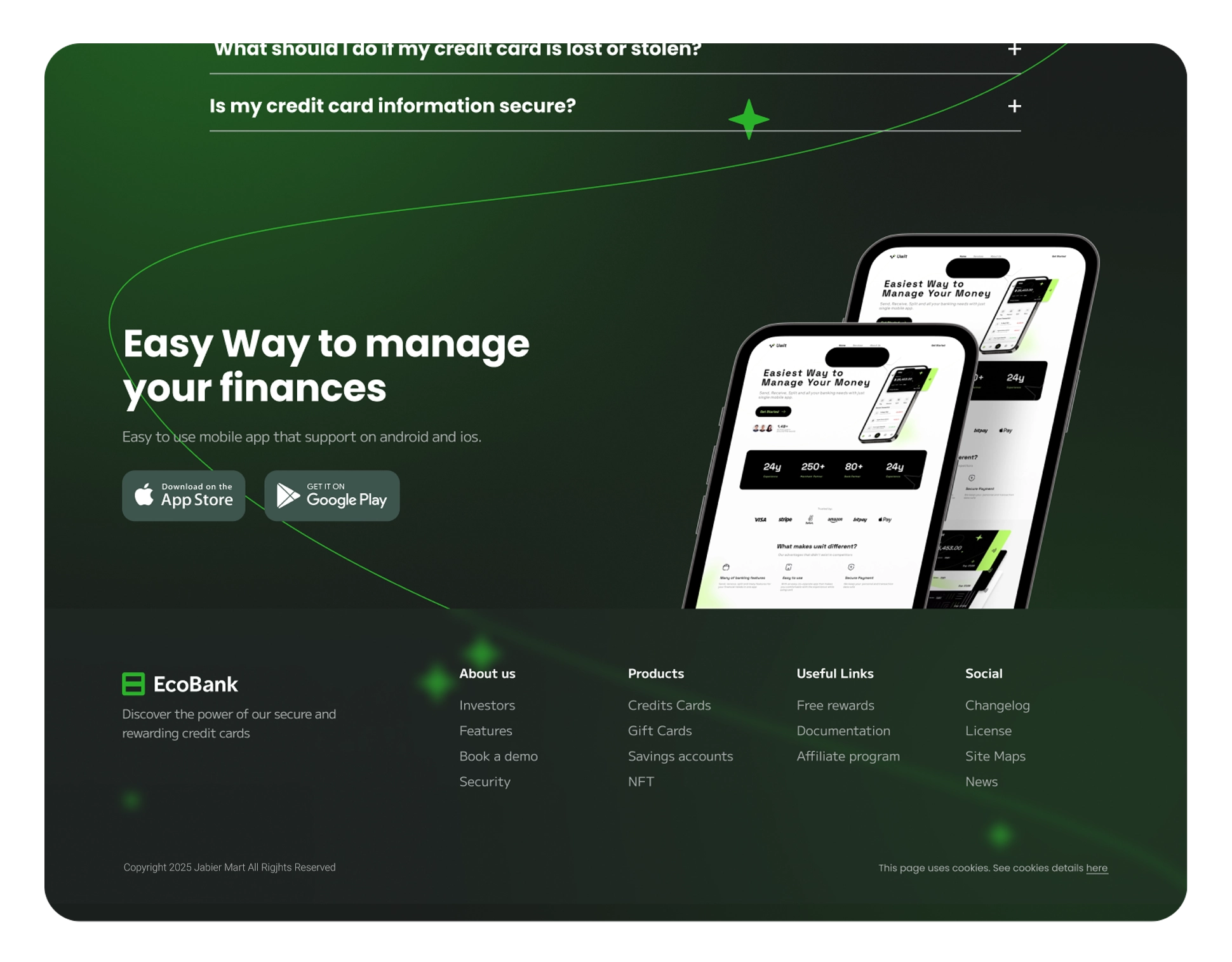
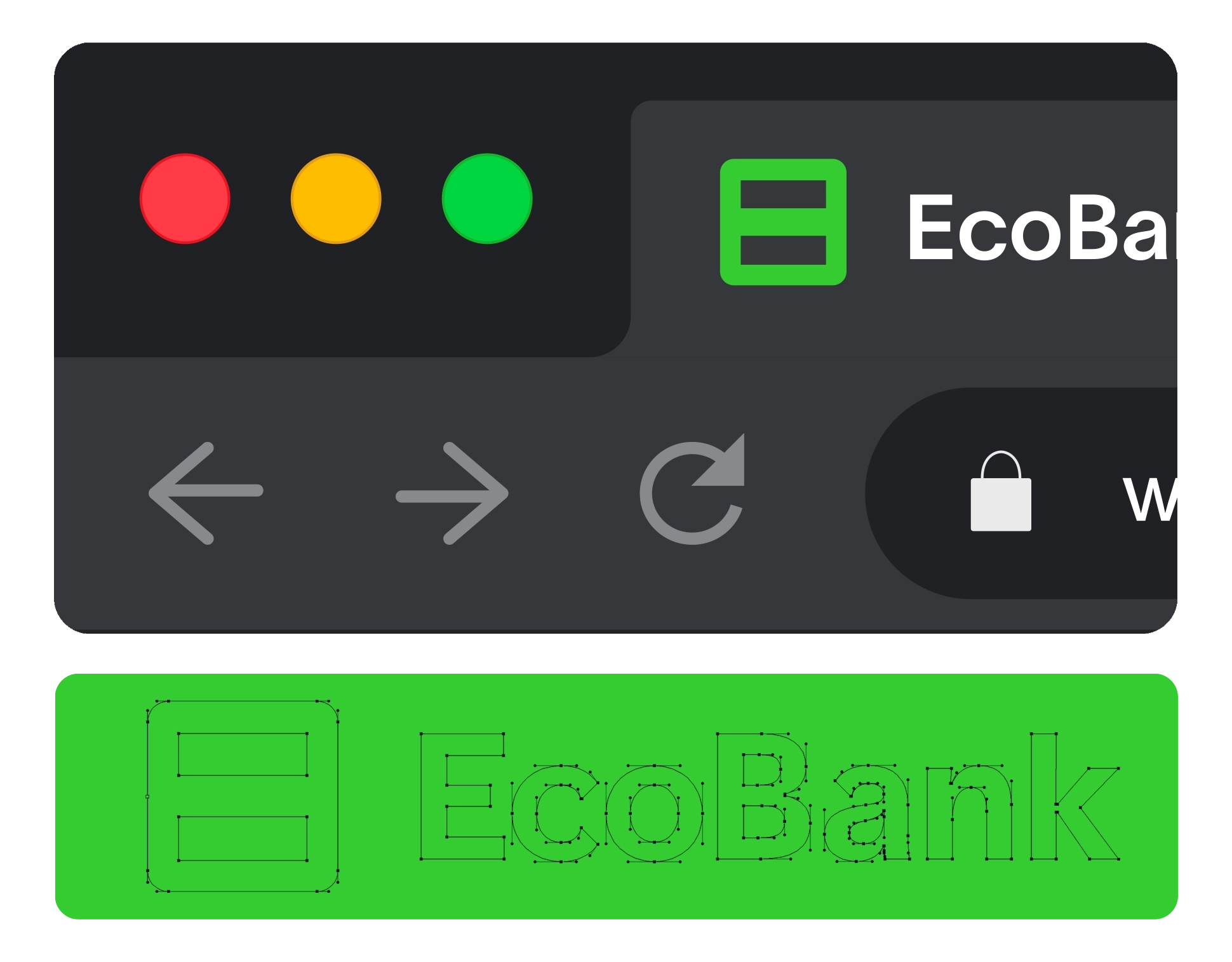
The EcoBank logo is a masterpiece of minimalist symbolism. Composed of two interlocking 'E's', it forms the mathematical symbol for equality (=) when joined together. This brilliant visual solution communicates its message instantly. The website uses a single-page application design with continuous vertical scrolling, divided into clearly differentiated sections that maintain visual coherence through a flexible grid system.
MY ROLE
As Senior Designer, I was responsible for the art direction and interface design... The result is a visually consistent, flexible and functional brand in both print and digital environments.
