Kapelmuur
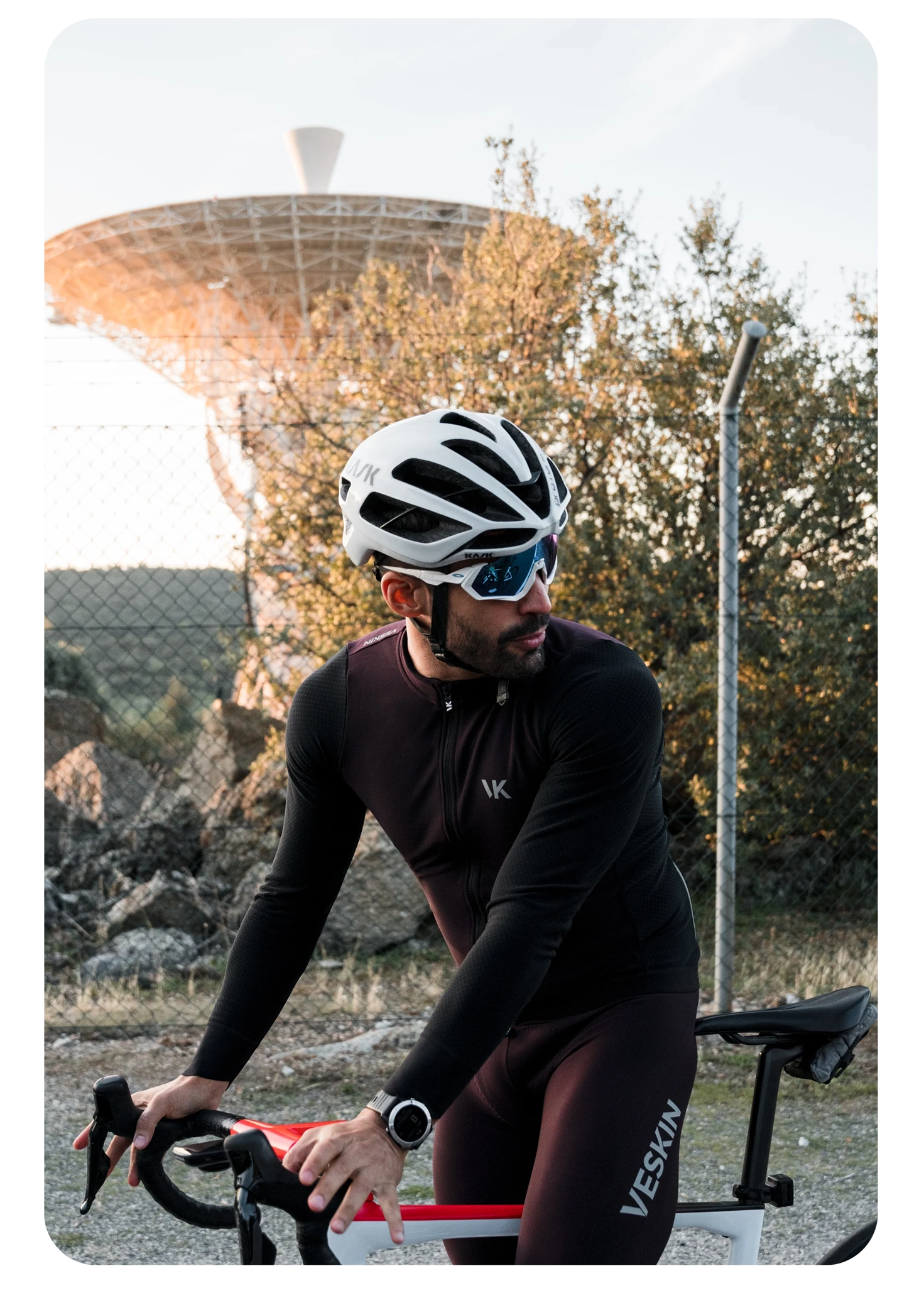
Branding Identity and UX/UI for Kapelmuur, Kapelmuur is an urban and sporty cycling brand that combines technical design with functionality and style.
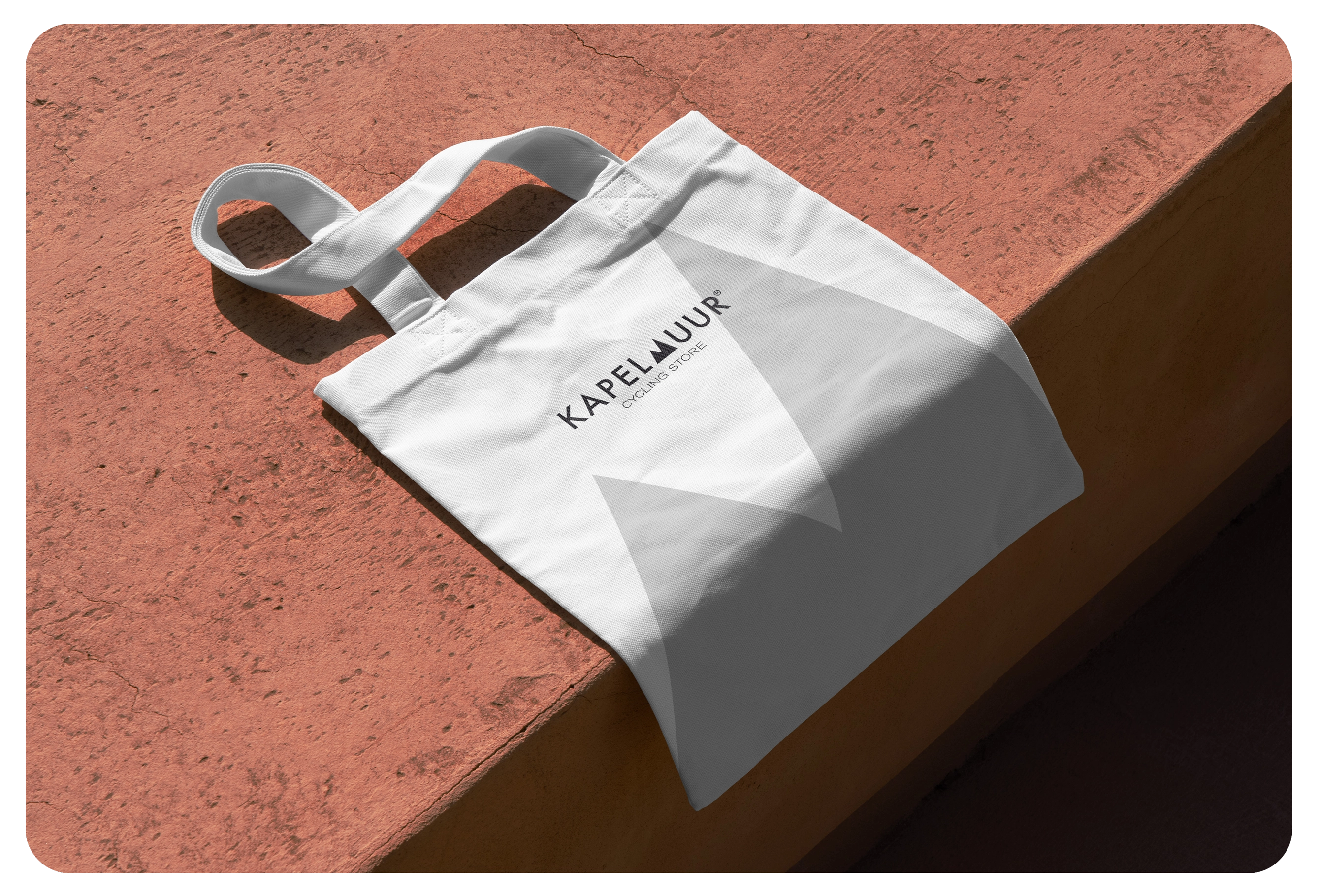
Brand Identity
UI/UX design
THE PROJECT
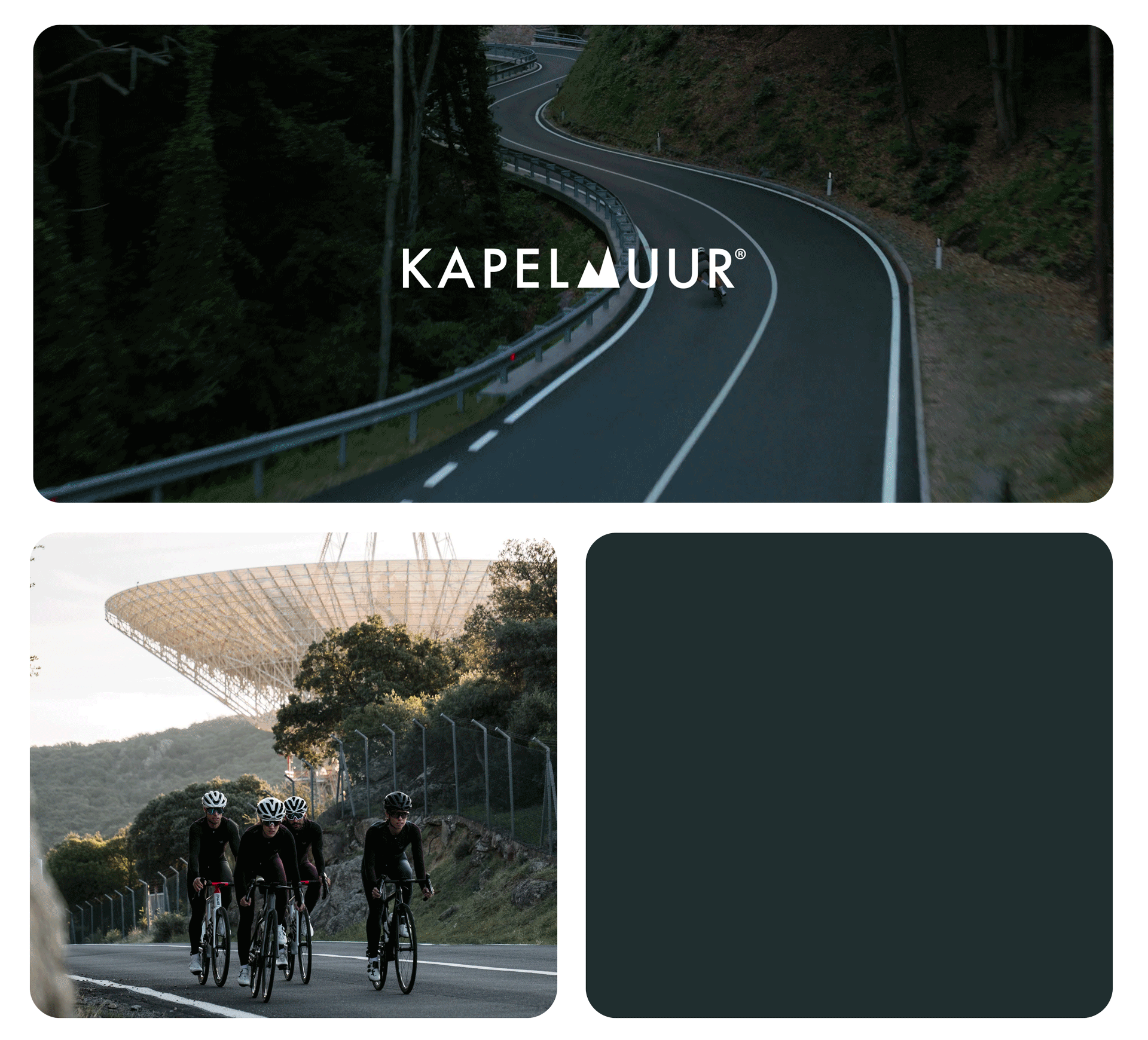
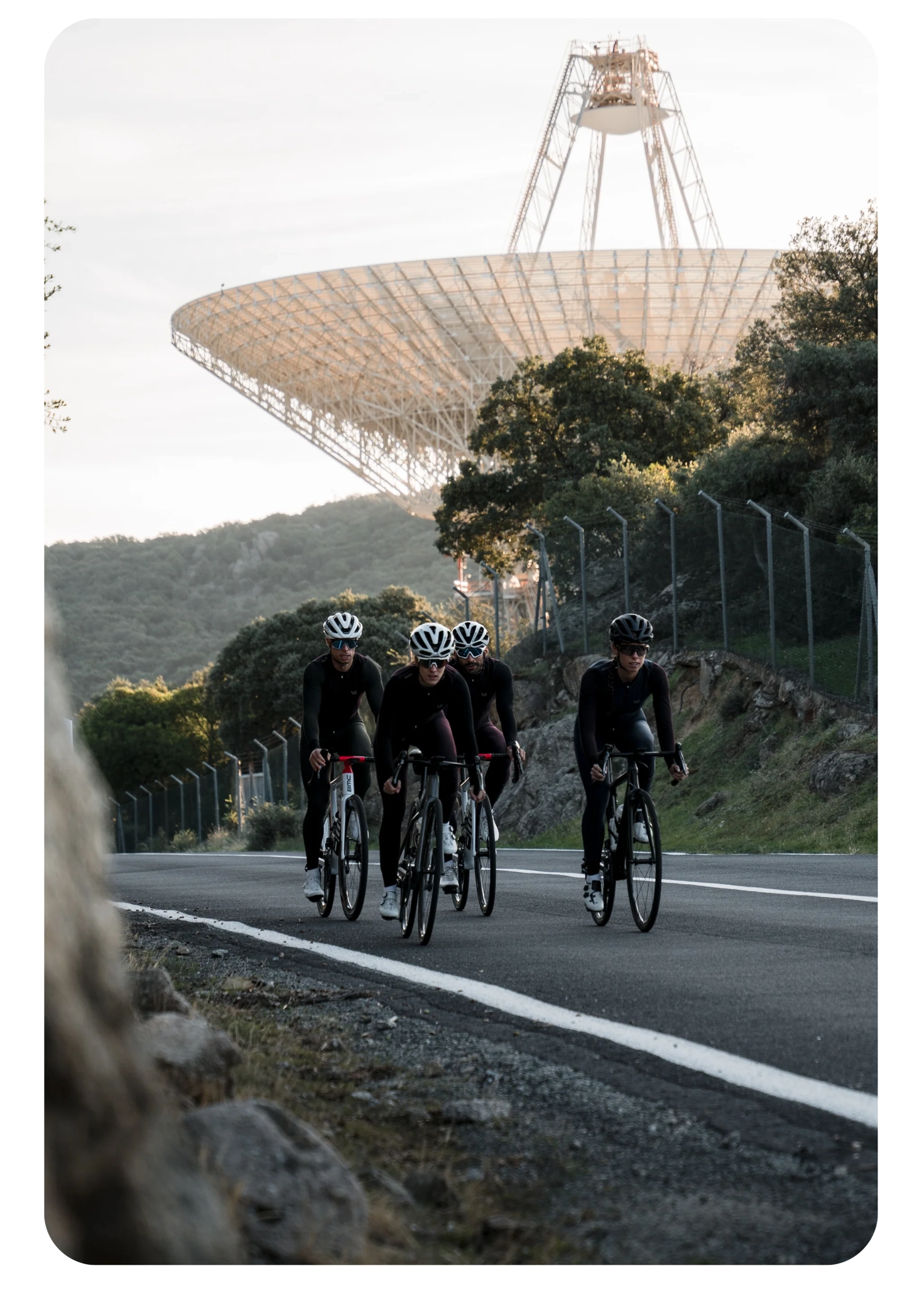
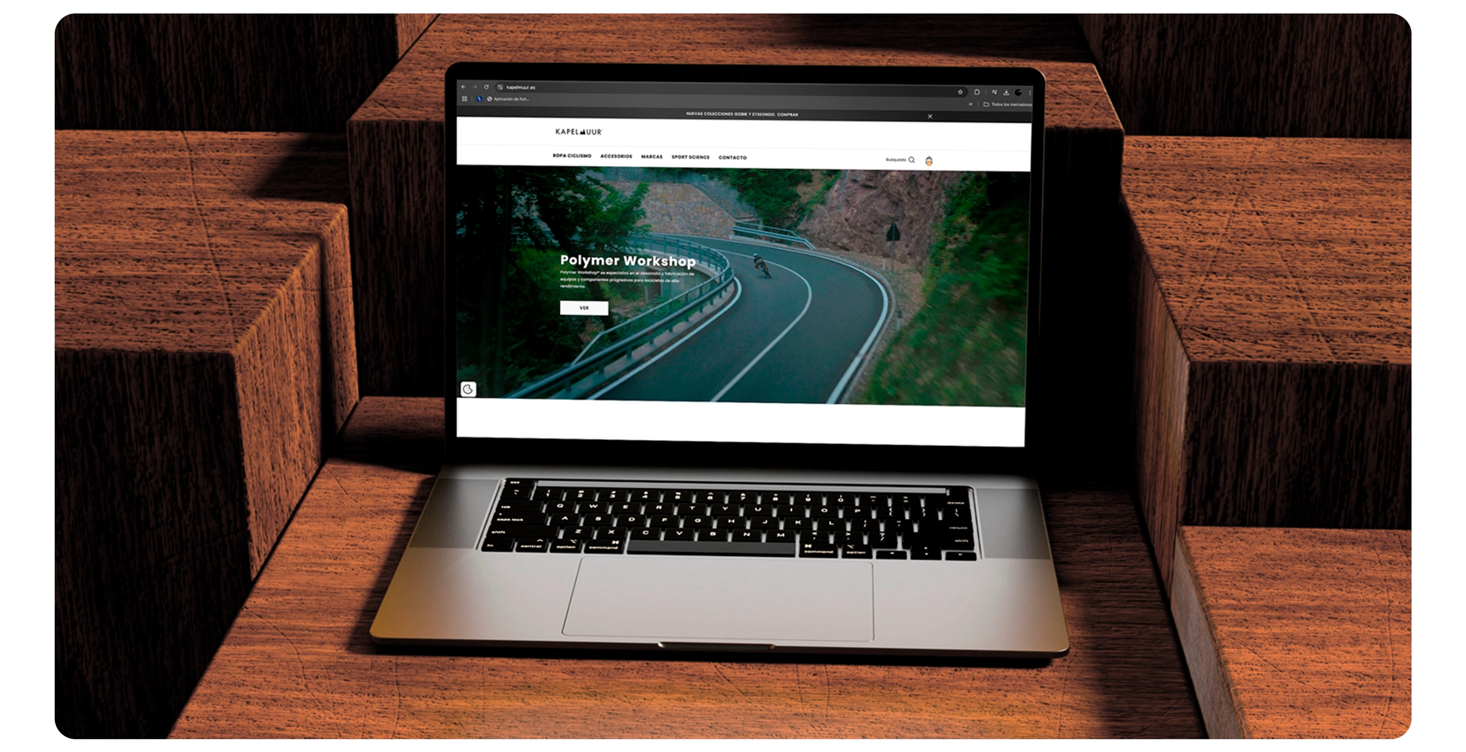
Kapelmuur is an urban and sporty cycling brand that combines technical design with functionality and style. Drawing inspiration from the iconic Belgian wall of the same name, Kapelmuur embodies passion, effort and elegance on two wheels.
DESIGN SYSTEM
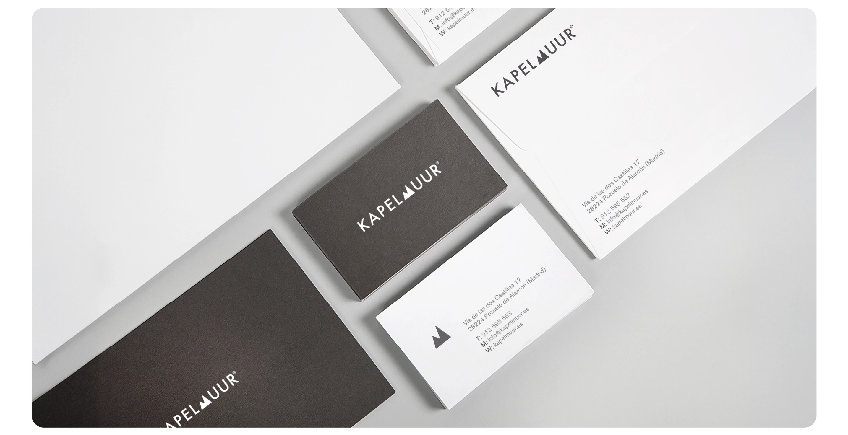
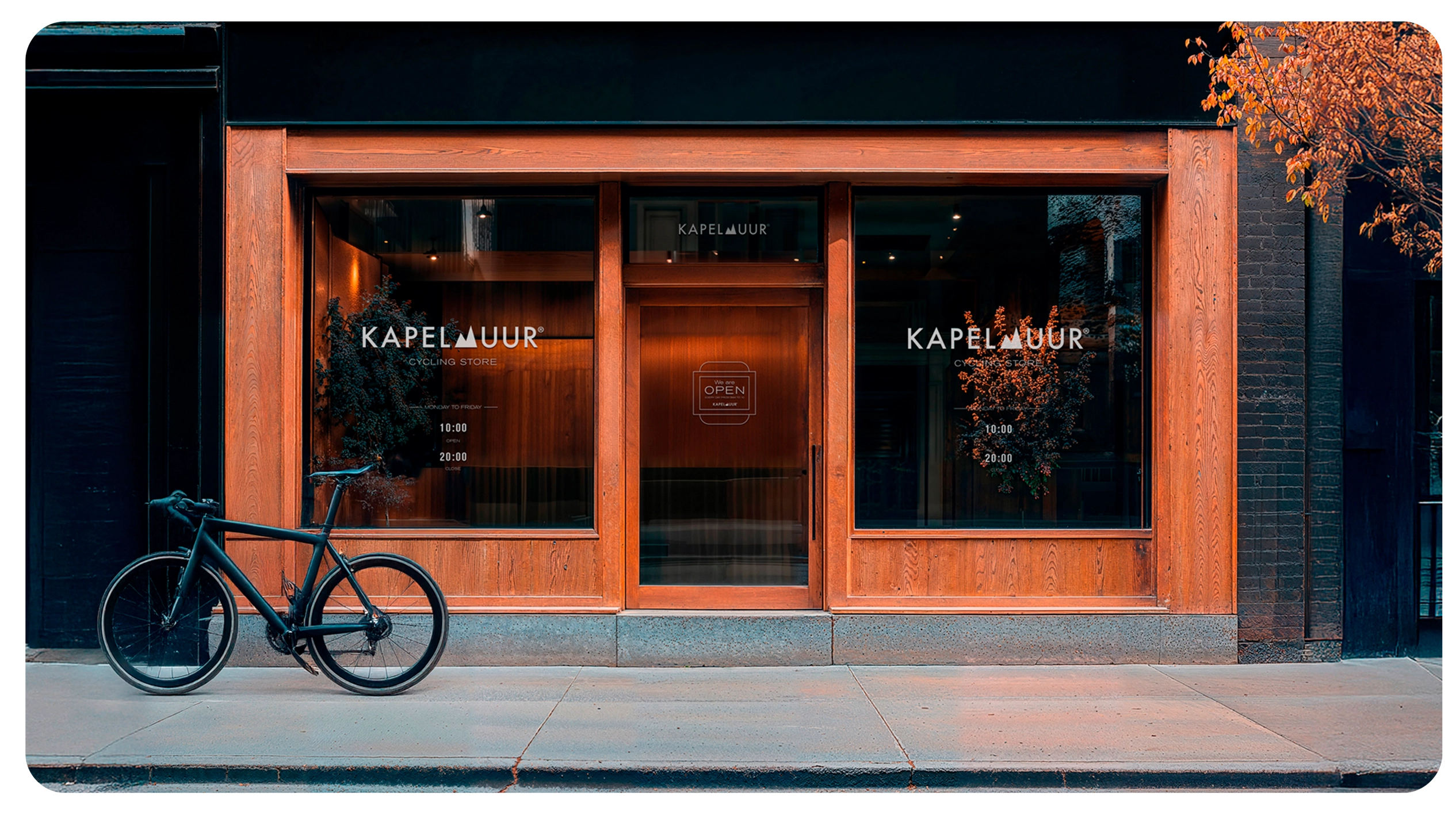
The work included the creation of the logo, the visual system (typography, chromatic palette, graphic style) and the consistent application of these elements in multiple media. In addition, I designed and structured their website whith wrodpress, with a focus on accessibility, clarity of information and user experience. The aim was to build an approachable and trustworthy image, reflecting their lifestyle and rutines.
MY ROLE
As Senior Designer, I was responsible for the art direction, interface design and brand identity, including logo design, visual system, and overall look & feel, ensuring consistency across digital and physical touchpoints.