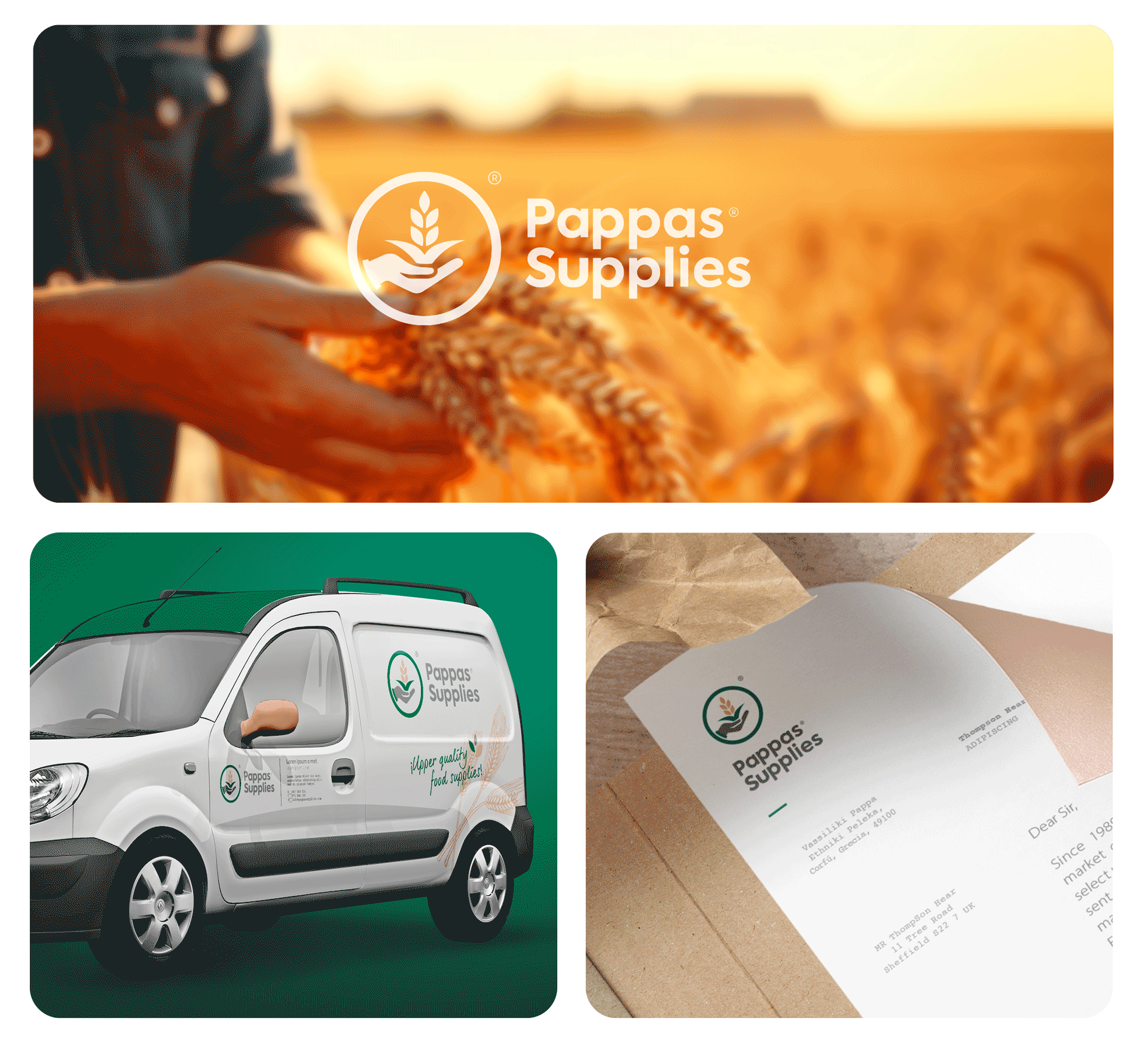
Pappas Supplies
Brand identity for Pappas Supplies, a company dedicated to selecting high-quality products with care and responsibility.
Branding and
Visual Identity
THE PROJECT
Standing firmly by the island's businesses, we make sure we offer our partners and consumers the very best. From generation to generation, always with quality and reliability in mind, we continue to create chronic partnerships, with distributions all over the island of Korfu. I developed a visual identity focusing on its careful selection of food offered to its customers.
DESIGN SYSTEM
The visual identity was designed to convey warmth, confidence and the idea of making a conscious choice, all the while maintaining a modern and professional approach.
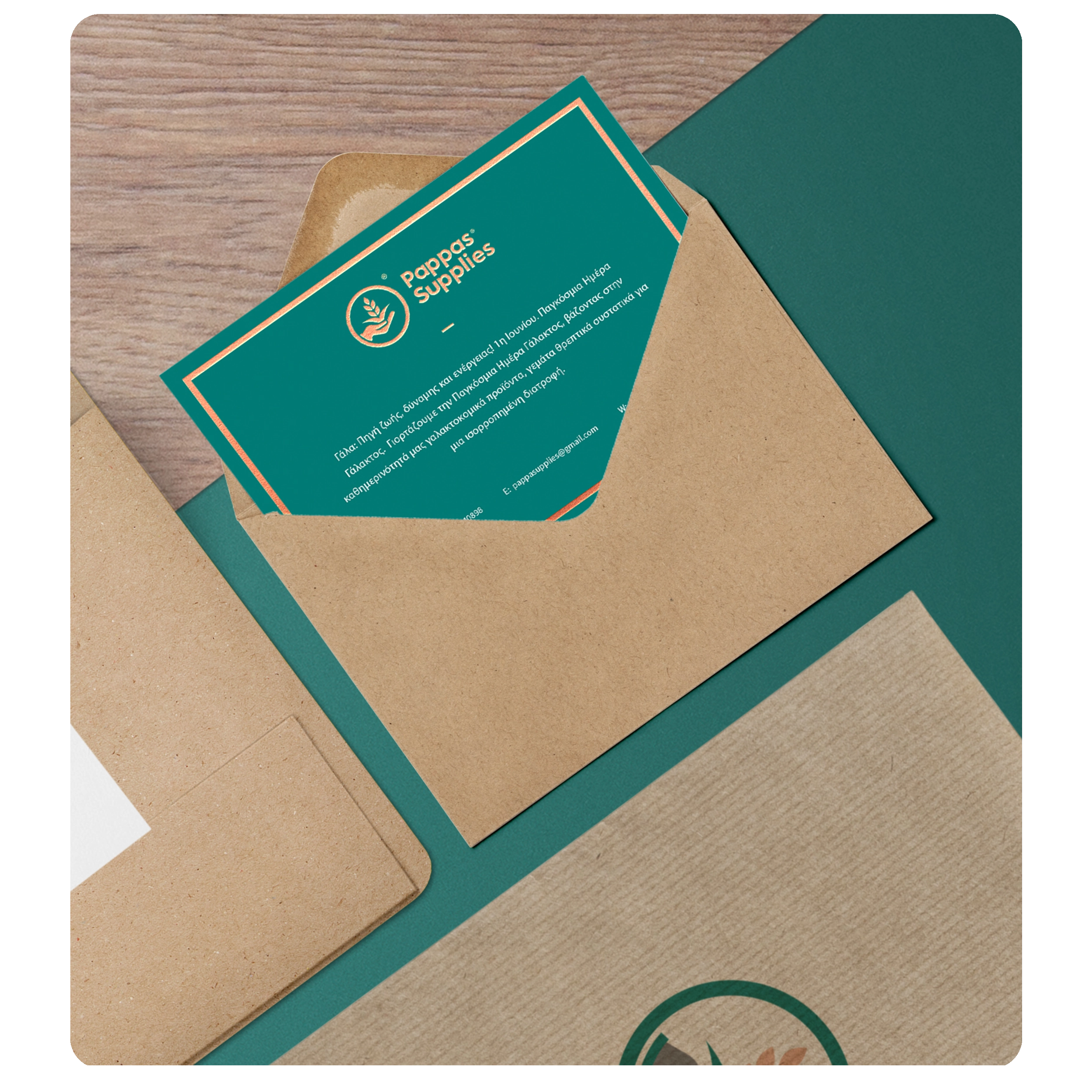
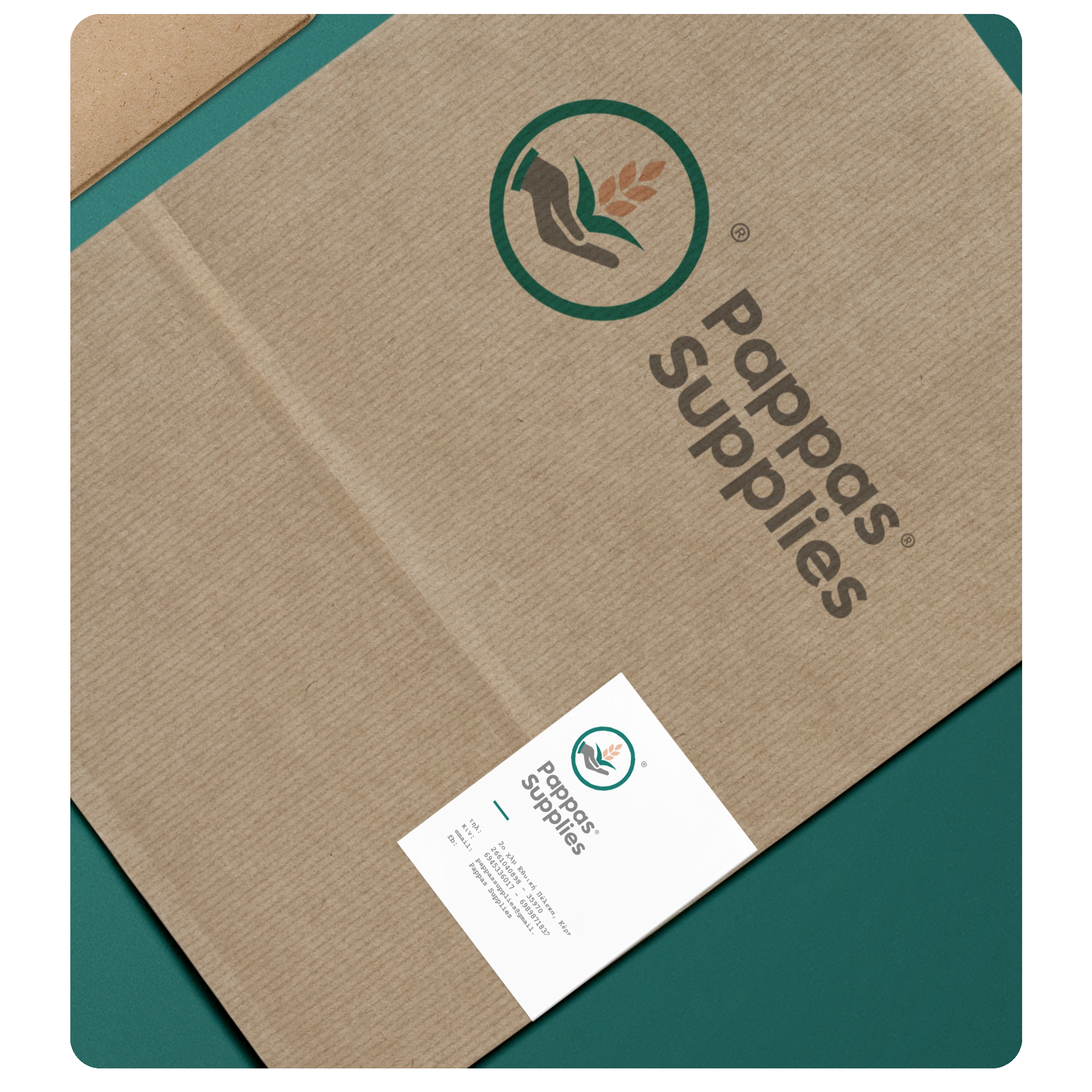
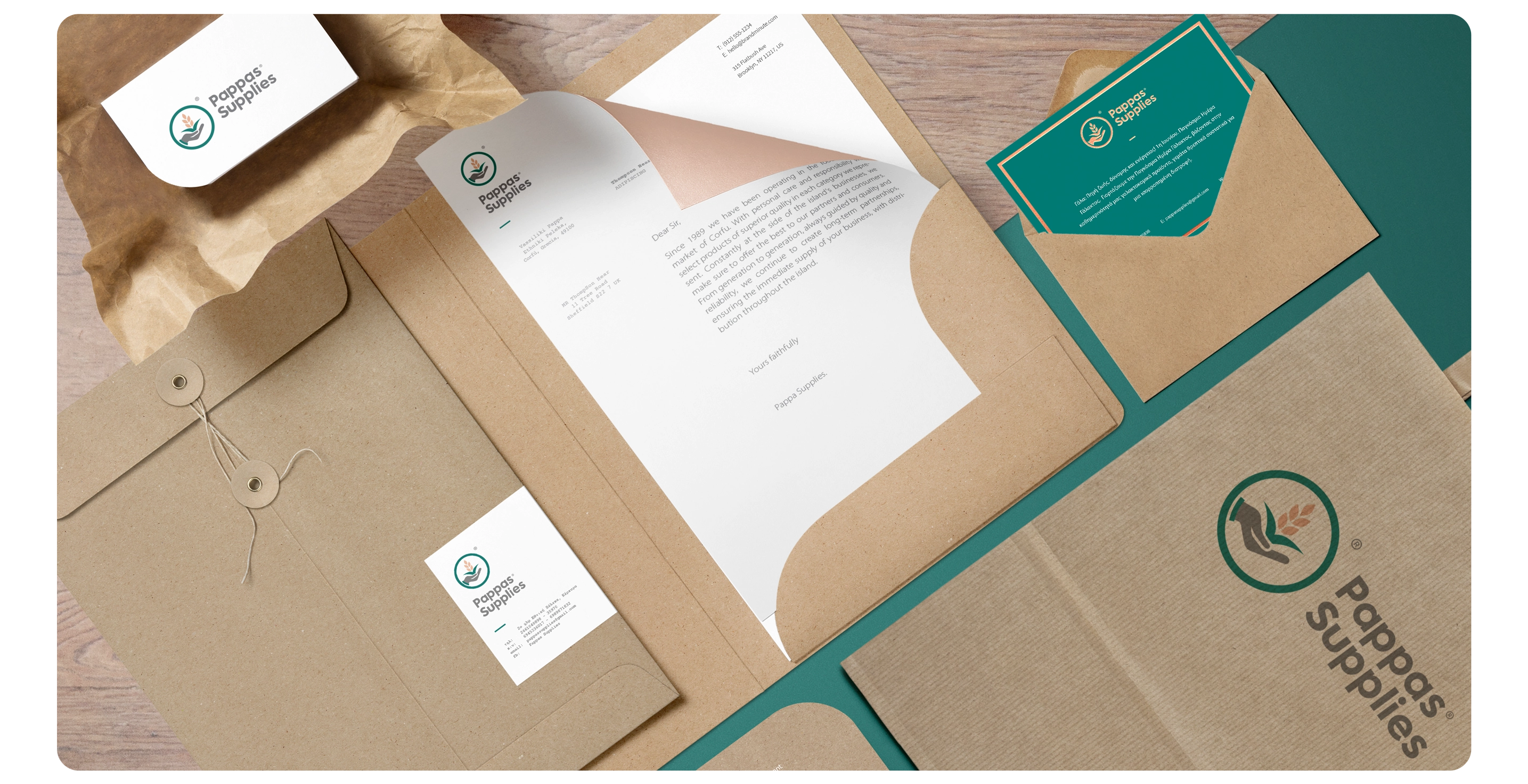
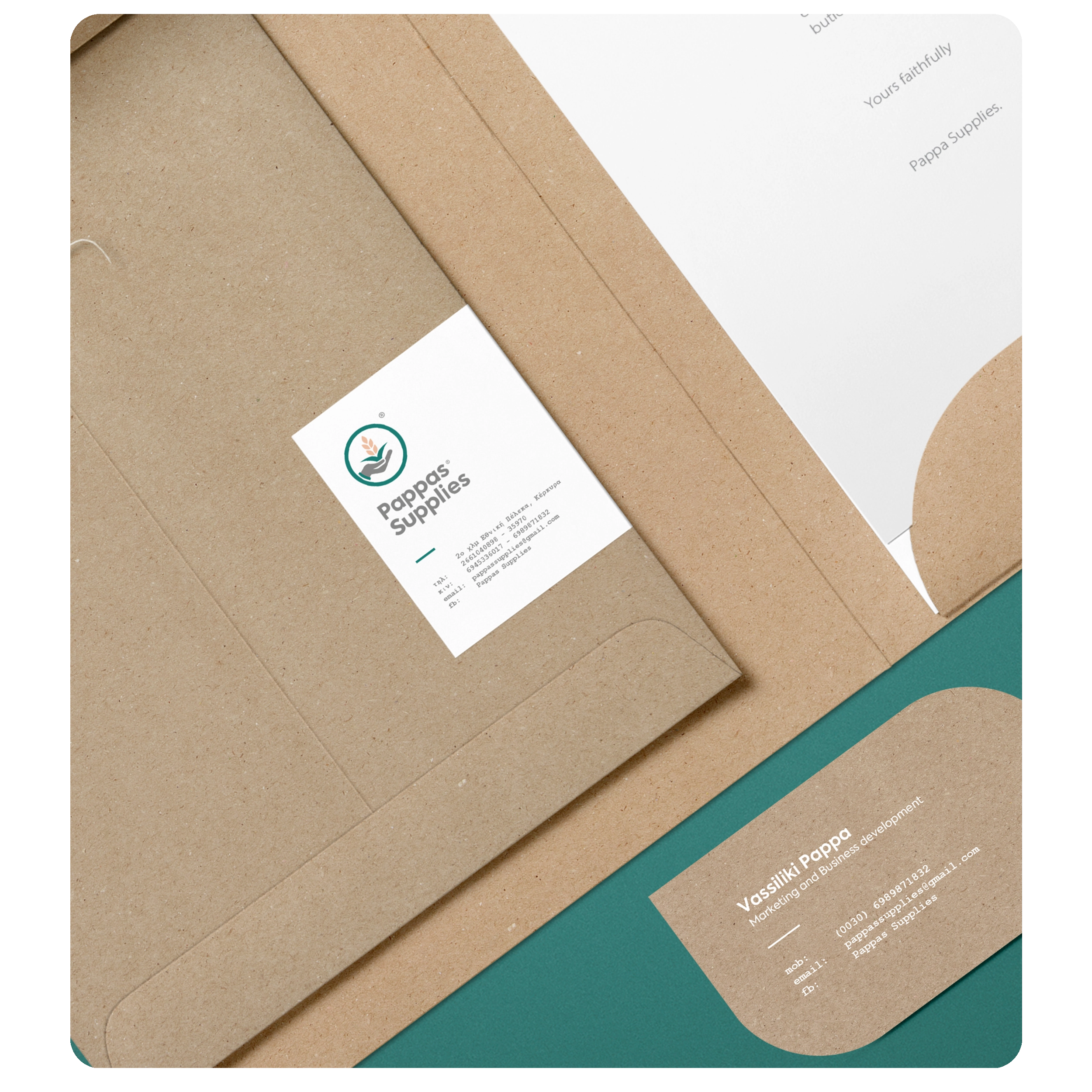
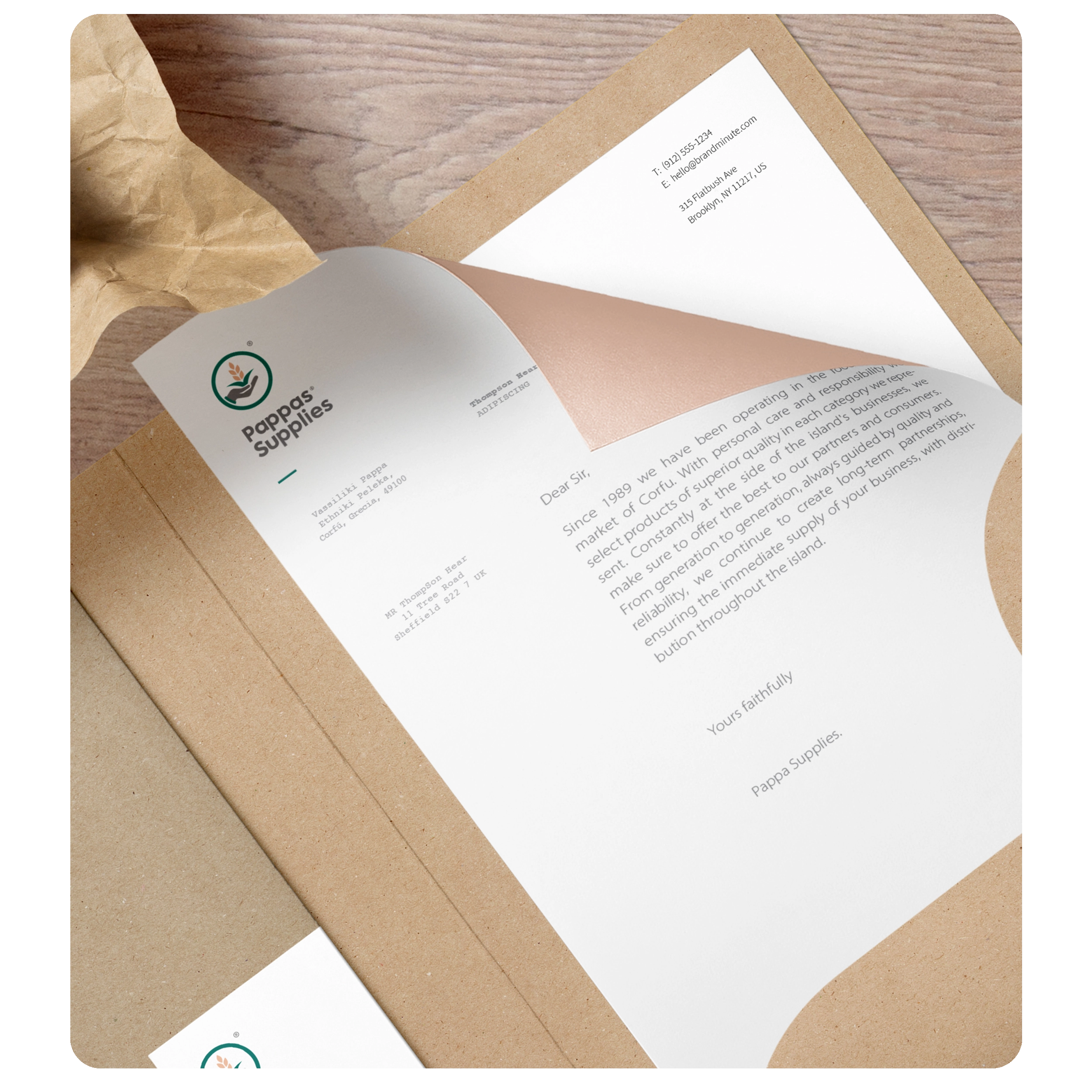
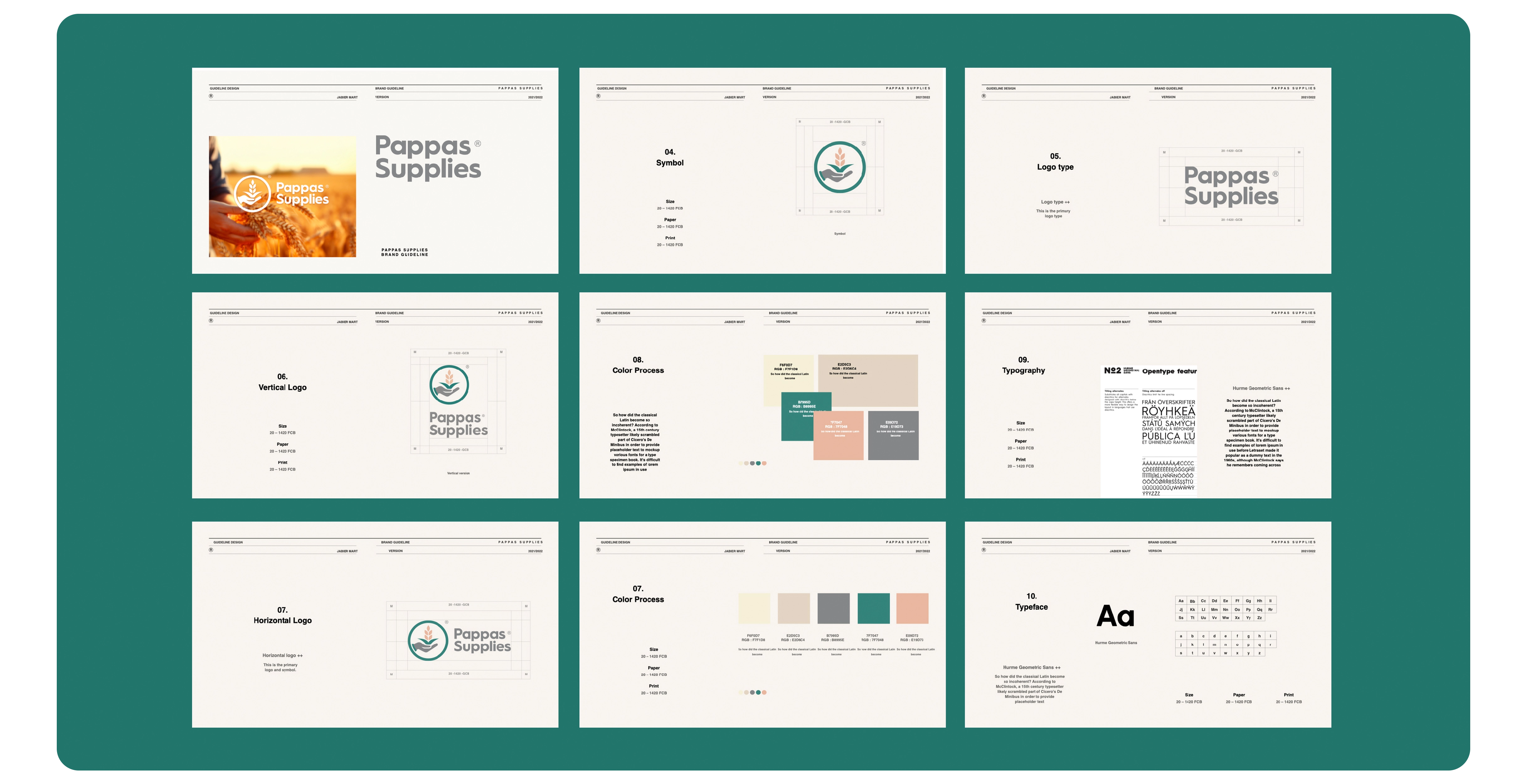
The logo features a plant symbol comprising leaves and ears enclosed within a circle, evoking notions of nature, freshness and the continuous cycle of life. The circle also represents community and lasting connection.
The geometric sans-serif typeface is clean and legible, providing a sense of structure, stability and accessibility.
The branding system uses an earthy colour palette of kraft combined with deep greens and warm details, referencing the natural product, fields and responsible production directly.
MY ROLE
As Senior Designer, I was responsible for the art direction and interface design... The result is a visually consistent, flexible and functional brand in both print and digital environments.